Designing & Decorating a Victorian Entrance Hall in Warkworth, Northumberland
Breaking down the 10-week commission
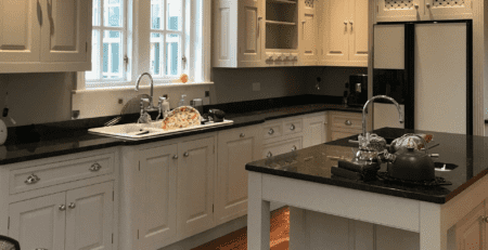
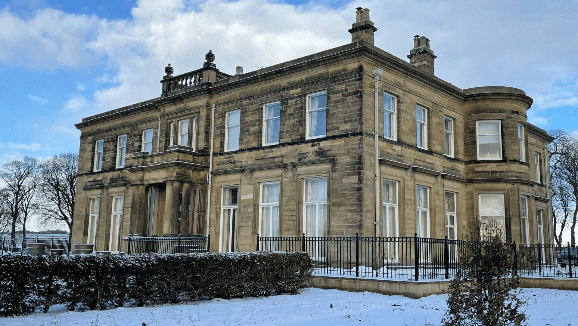
Once a care home, this beautifully impressive Victorian hall in Northumberland is being lovingly restored to its former glory by it’s new owners as a private residence.
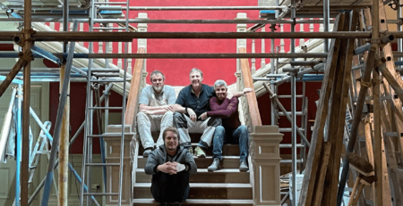
I was fortunate enough to be given the commission of designing and decorating the huge entrance hall.
After many set backs and deliberations the work finally began on January 4th 2021. The day the nation went into it’s third lockdown.
It was a 10 week commission that I had to navigate safely and lawfully right through to March 12th 2021.
Tricky to say the least.
Because of the sheer scale of the commission, the blog is massive too. So I’ve cut it into 3:
- Design.
- The Team and Preparation.
- Painting and Completion.
The Design
Because of the tremendous size of the entrance hall and the various areas within it, I decided to break the design into sections and build it up from there.
Essentially I wanted the various areas of the hall to lead into one another. Layers of colour, pattern and softly broken paint effects with every corner you turn. The decoration changes yet compliments and is entirely sympathetic with the impressive Victorian architecture.
The sections were as follows:
- Main hall
- Outer galleries
- Staircase
- Domed ceiling
- Woodwork and panelling
- Vestibules
The Main Hall
The main hall was too big to wallpaper. It was also too big for a single flat colour. A paint effect was the obvious choice; a broken ‘evenly uneven’ effect with a depth of character in a classic Victorian colour.
Sounds easy enough. The trouble was with the ‘big’ wall. There had to be 2 lifts of scaffold alone to encompass it. Only one person can execute the paint effect. As with handwriting, the effect of two people applying the same effect would be entirely different and horribly discordant to the paint effect I was trying to achieve. So it was down to me and my big brush.

Outer Galleries
For the outer galleries I decided to wallpaper. Luckily the client’s great sense of style, daring, and trust led us to choose the fabulously dramatic William Morris wallpaper, ‘Golden Lily’.
This made finding the perfect colour for the main hall much easier. We agreed upon a bold and rich Victorian red for the main hall itself. I wanted this red to have real depth and movement. So the sampling began on the walls of the studio.
I’d done a similar effect 30 years ago for Sir Peter Moores on his entrance hall at Parbold hall, so I had an inkling of where I should begin. With a bright yellow adhesion primer basecoat and build up layers of cross hatched red topcoat and burgundy glazes.
Samples
The trick is with these giant entrance hall walls is not only making sure the paint sticks to them, but creating an evenly broken paint effect on such a large scale. So there’s no point in giving the client A4 samples for their approval as more likely than not, that size sample will not be achievable on such a great scale, therefore I design the wall effects on actual walls in the studio. I can then produce realistic, smaller samples for the client’s approval.
I also wanted a paint effect for the decoration of the north and south vestibules but didn’t want to just continue with red. Therefore a green was chosen very similar to the evening room that I painted the previous year. This also allowed the design to drift into other rooms attached to the hall, something I particularly like to consider when designing schemes.
Woodwork
There was also an enormous amount of woodwork. Panelling, doors, headers, arches, skirts.
Not to mention the staircase. Oh man the staircase! With it’s 170 spindles all caked in layers of drippy care home cream gloss. Nightmare!

Finding the colours for all of these elements was quite tricky. You can’t just pull a colour from a tiny paint chip on a colour card. It would never work. The colours were all hand mixed. Bespoke. Every one of them sampled into subtle layers of paint effects, colours on colours. These are then ‘offered up’ (great Lancashire phrase!) to see how they would sit alongside the main event.
The colours and paint effects for all the woodwork elements had to enhance the main decoration. Not detract from it.
Bespoke Colour Scheme
The initial colour tests seen here shows how bold I had to go just to keep up with the main scheme. I find it fascinating that the colours chosen compared to what you’d expect to chose from a manufactured colour card differ so enormously.
There were only 2 areas that did not have a paint effect on. These were the ceilings and the staircase spindles. I wanted to lose the spindles within the decoration as much as possible. You can see on this picture here how dominant they are.

To do this, ensure the whole scheme worked together and so the clients could see exactly what they would be getting, I site sampled all the decoration. The spindle colour was hand mixed on site once the other areas had been sampled. That’s how I arrived at the colour for them as once again, you could not pick such a colour from a colour card.
Stained Glass Dome
The fabulous domed ceiling was another factor. It took 3 scaffold lifts to get up there and once there it was massive! Again, deceptively strong colours were used to connect the magnificent ceiling into the overall scheme.
Being the designer, boss and on the tools ensures there is no room for error with the commission. The buck stops with me. It also allows me to change the design, application, and colour if necessary. The arches are a good example of this. Originally supposed to be the woodwork colour, once a couple were painted up, I wasn’t entirely happy with them and decided to change the underside to the wall colour. You can see on these photos here how much better it looks.
So that’s how I got to the final design. Now all I had to do was execute it… easier said than done!
My next blog goes into detail of the mammoth task of preparation.